FiveSixTwo, Inc. Agency Website
FiveSixTwo wanted to build a web presence and grow their clientele. I adapted a Google Design sprint process to build and test three concepts.
Background
FiveSixTwo’s website and my first time conducting a Google Design Sprint. I worked on the copywriting, built wireframes and prototypes, and made a Bootstrap website to test. We tested concepts with quantitative and qualitative user testing.
Sprint Process
Day 1: Map out the Problem and Choose a Focus
My CEO and I discussed long-term goals for the company’s website and chose our target.
- Target: Get more clients
- Metric: Client makes contact (fills out the form or makes a phone call).
Day 2: Rapid Sketching Solutions on Paper
I spent the next phase sketching different ideas. We decided to explore the following:
- How fast can we generate leads (make contact)?
- What should be the website’s point of view? What will get more quality leads?
- Partnership - What are they looking for?
- Our process/our values
- Products/technology expertise
Day 3: Storyboard and Pick Solutions
We narrowed down the sketches to 3 different ideas.
Concept 1: Experimental Form
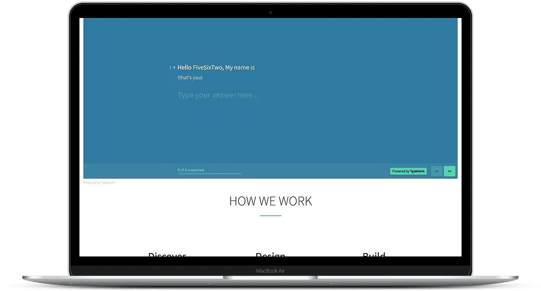
- A large conversational form instead of a hero image
- Quick description of our process, how it relates to a client
- Testimonials
- About Us with photo
Concept 2: Process Oriented
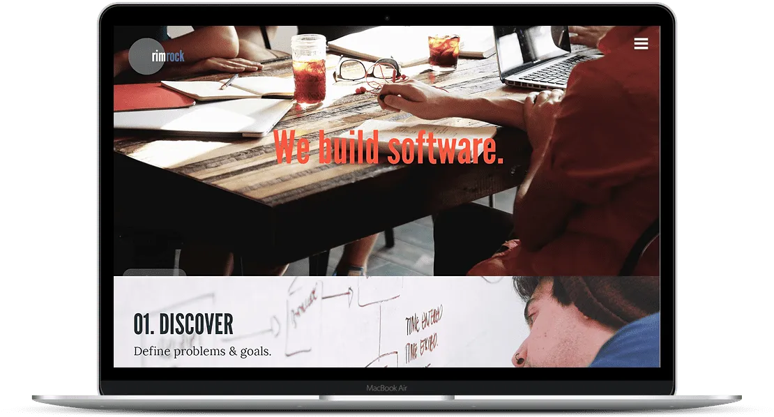
- Shows how we work and what we value
- Content rich interior pages
- Lots of process photos
Concept 3: Goal Oriented
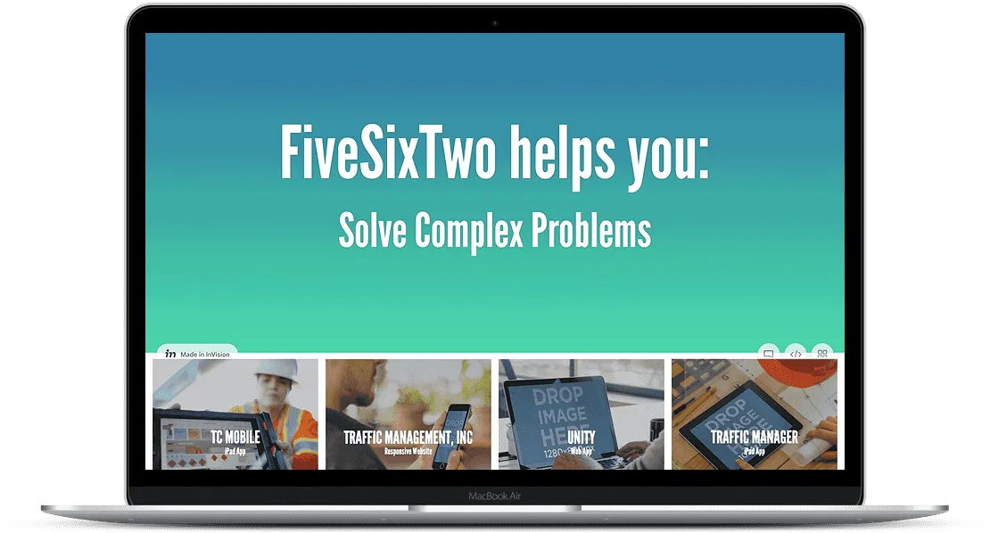
- Animated header cycling through “Build and Scale Software, Solve Complex Problems, Reach Your Goals”
- Highlights 4 projects, with project pages
- Graphs/data heavy
- Company bio in footer
Day 4: Prototyping
I made Concept 1 with Bootstrap and Typeform and Concept 2 and Concept 3 with InVision (RIP).
Day 5: Testing
I wrote a screener for UserTesting.com and ran several rounds of user tests for the 3 prototypes. This round rigidly explored how we should present our point of view.
Results:
Prototype 1: Experimental Form
- This was the only form that was clicked on and completed. Contact form on top of the homepage was very unique, surprising, and memorable.
- Implementation of the form was confusing. I used a free version of Typeform, and their branding after submission confused users and caused them to leave the site. Also, the services dropdown in the form was not as clear as it needs to be.
- Ambiguous about our services.
- Blog wasn’t very clear about our personal ideas.
Prototype 2: Process Oriented
- Showing our step by step process makes the company seem very approachable and “human”
- Photo heavy style seems consumer, not business, facing.
- Testimonials give more credibility
- Ambiguous about who we are and what we did for clients.
Prototype 3: Goal Oriented
- Including shots of our work made our intended audience/niche market very clear.
- There was some ambiguity about our services. Project names were also unclear (mistook them for companies we worked for).
- Project pages need more content, like testimonials, screenshots, and our process.
- Browsing experience was disjointed. Users wanted to see a traditional “Services” and “About” pages.
Overall:
- Credibility on all 3 was low. We need more content.
- Need an About page
- People want a personal connection to the team
- Show the team’s faces
- Explain company name
- Could benefit from a more traditional navigation, with clear Services and About Us links.
- Link testimonials to actual products or companies.
- All 3 prototypes had positive reactions. Users basically wanted to see all this content when searching for an agency.
- The Bootstrap prototype tested better than the InVision prototypes.
Round 2
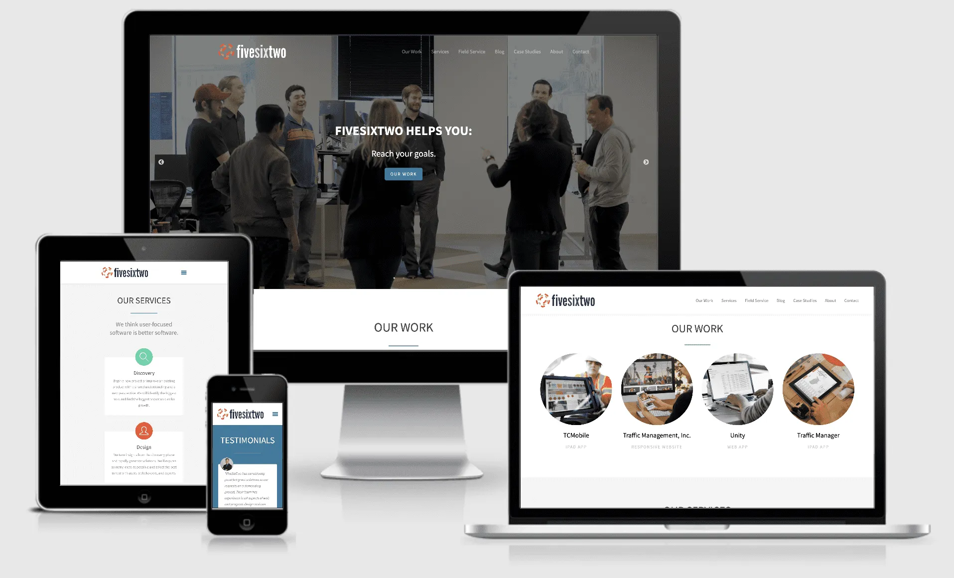
I took the findings from Round 1 and I used Bootstrap to make a larger website that included the effective parts from each prototype. I wrote 4 case studies, talking to developers and the CEO as needed. For this round, I also had users review two competitor sites.
Findings:
- Users spend most of their time on the homepage.
- All claims and testimonials need sources.
- Consider more transparency in pricing or consultation fees. This was one of our competitor’s biggest strengths. Users felt more comfortable knowing the price. This could increase quality leads.
- Keeping the site updated regularly and having social media links add authenticity.
- Users would also Google companies too see if anyone has posted anything about them on social media or message boards.
- The form from the first prototype is still memorable as “really clever” and a surprising “human touch.” It is now on a Contact page and we have a paid version of Typeform so users stay on the site and are no longer confused.
- FiveSixTwo “branding” (it was not branded) is too generic.
Round 3 and Beyond
I worked with a developer to make the Bootstrap prototype a “real” website. FiveSixTwo brought in a Sales Director to add more content, a blog, and a Field Service landing page/site experience.
- Date: 2015-2016
- Role: Designer
- Team Composition: 1 designer, 1 engineer, CEO
- Company: FiveSixTwo, Inc.